Most recent comments
2021 in Books -- a Miscellany
Are, 2 years, 3 months
Moldejazz 2018
Camilla, 4 years, 8 months
Romjulen 2018
Camilla, 5 years, 3 months
Liveblogg nyttårsaften 2017
Tor, 6 years, 3 months
Liveblogg nyttårsaften 2016
Are, 7 years, 3 months
Bekjempelse av skadedyr II
Camilla, 2 months, 3 weeks
Kort hår
Tor, 3 years, 3 months
Ravelry
Camilla, 2 years, 10 months
Melody Gardot
Camilla, 4 years, 9 months
Den årlige påske-kommentaren
Tor, 5 years
50 book challenge
Camilla, 3 months, 2 weeks
Controls
Register
Archive
+ 2004
+ 2005
+ 2006
+ 2007
+ 2008
+ 2009
+ 2010
+ 2011
+ 2012
+ 2013
+ 2014
+ 2015
+ 2016
+ 2017
+ 2018
+ 2019
+ 2020
+ 2021
+ 2022
+ 2023

Pretty colours!

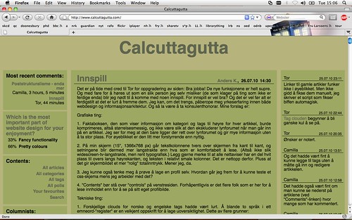
So. Tor has written a fancy page and it is really quite impressive. I can do all kinds of things and have already spent altogether too much time tagging things and retagging them and then changing the tags about. Still, all good.

Except, deep in my heart I know the page is ORANGE to all newcomers, and while a splash of orange can be a delightful thing, an entirely orange page is disturbing at best. Our colourblind readers may not care about any of this, but since I am the type of person who chooses operating systems based on what they look like ....

On Tor's request I have therefore spent a couple of days now, suffering through the unexpectedness of the random colour scheme, all to find pretty colour combinations for your benefit. I hope you appreciate it.

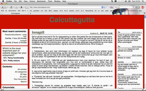
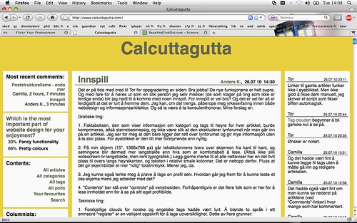
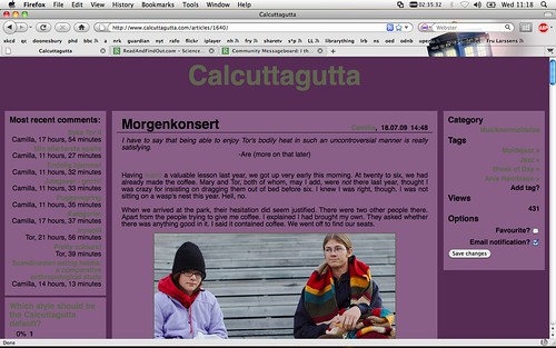
1. This one is the one I am currently using (background CC1100; columns FAFAFA):


2. I am thinking about changing it to this (background 80100D; columns FAFAFA):


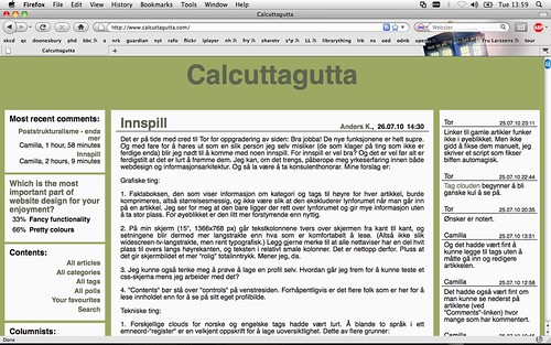
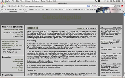
3. For the more mellowly inclined (background 9DA963; columns FAFAFA):


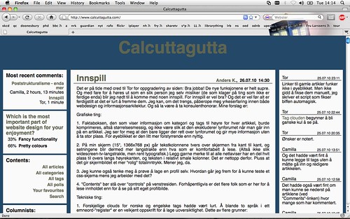
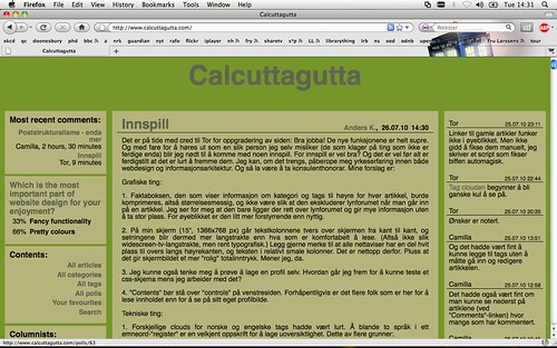
4. For the slightly less mellow (background 559012; columns FAFAFA):


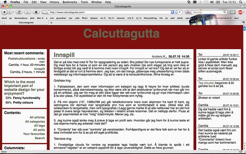
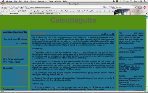
5. For the blue (background 237492; columns FAFAFA):


6. For the bluer (background 234868; columns FAFAFA):


7. For the blue, but mellow (background 45748E; columns FAFAFA):


8. For the bluest (background 234868; columns 45748E):


9. For Mary? (background 562C55; columns FAFAFA):

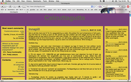
10. For the yellow (background E9CF40; columns FAFAFA):


11. For the grounded (background 794524; columns FAFAFA):


12. For the somewhat insane (background 559012; columns 237492):


13. For the mental (background 78407A; columns E9CF40):


14. For the slightly mossy (background 759629; columns B6B47C):


15. For the deeply feminine (background 562C55; columns 8C1432):


16. For those who really, really don't think it's true that blue and brown don't go together and that that is just a silly prejudice created some time in the 70s or 80s or possibly even 90s, and who don't care if the screen gets very dark (background 234868; columns 794524):


17. For the recently military (background B6B47C; columns 9DA963):


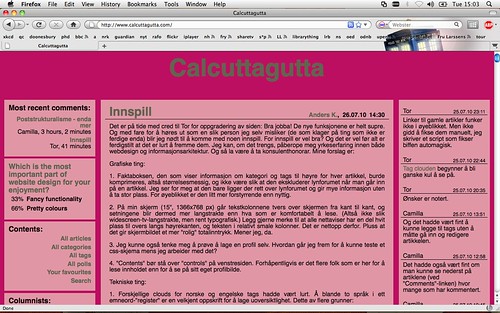
18. For the deeply (disturbed) girly (background BC0F61; columns E196A6):


19. And for the deeply boring (background CCCCCC; columns 666666):


If none of these meet with your approval, you are of course free to suggest others. And if wild experimentation is not your thing, the easiest way of getting hold of colours you like is going to the source code (?) of the page you are on (on a mac, you get it by pressing command+u) and checking what the precise numbers are.

It may all be a moot point if we get a really pretty css up and running. But we need to do something about the ORANGE.

Comments

Anders K.,  27.07.10 16:16

while a splash of orange can be a delightful thing, an entirely orange page is disturbing at best. Our colourblind readers may not care about any of this,

I am one of our colourblind readers, and I can inform you that the orange/grey combination that is slightly to very uncomfortable to most of you, makes it difficult for me to know whether I'm looking at a webpage, the inside of Timothy Leary's head or the remains of Las Vegas hit by one of those phosphorus-based bombs. If I didn't already know the grey stuff was text, I'd never find out. Also, this is one of perhaps five times in my life that my relatively mild colourblindness has caused me any practical problems. So, from an include-the-handicapped-point-of-view, the orange is a lound and clear NO GO.

As far as no orange goes.
Tor,  27.07.10 16:38

As I said before, the colour is more of an accident than a design choice. First, I picked two shades of green I thought were ok together, but then Camilla told me they made her sick, so I picked something else, and I never saw any reason to change it, as I imagine better styles will be made by someone else.

So pick a number, any number, and I will make it the default.
Tor,  27.07.10 16:48

I see that we need to have the ability to create polls with more than ten options. Will fix.
Torgar,  28.07.10 10:45

Some of the colour themes looks nice, but I feel that the gray headings and the like (the Calcuttagutta text at the top and the text in most recent comments) reads poorly with some of the themes.
Camilla,  28.07.10 11:29

I have been telling Tor that from day 1.
I suspect the best way around that would be an image logo as heading, rather than a text link.
Tor,  28.07.10 11:38

And you will get to choose your own colours for EVERYTHING! Yay!

Purple galore (background 562C55; columns 895F88):

Camilla,  23.01.11 20:58


Since Tor has done something strange, the effect of a dark central colour is now lessened (except in profiles), and I quite like the result.

The colours here are background: 51002E; columns: 678A3B

Anders K.,  23.01.11 21:27

When will we be able to link up background images?
Tor,  23.01.11 21:29

This has been possible for half a year, through custom css. But I'm making some enhancements to this funcionality, and I'll make a post about it later today.
Category
Technology
Tags
calcuttagutta
Views
4452
Last edited by
Camilla, 30.07.10 11:03